
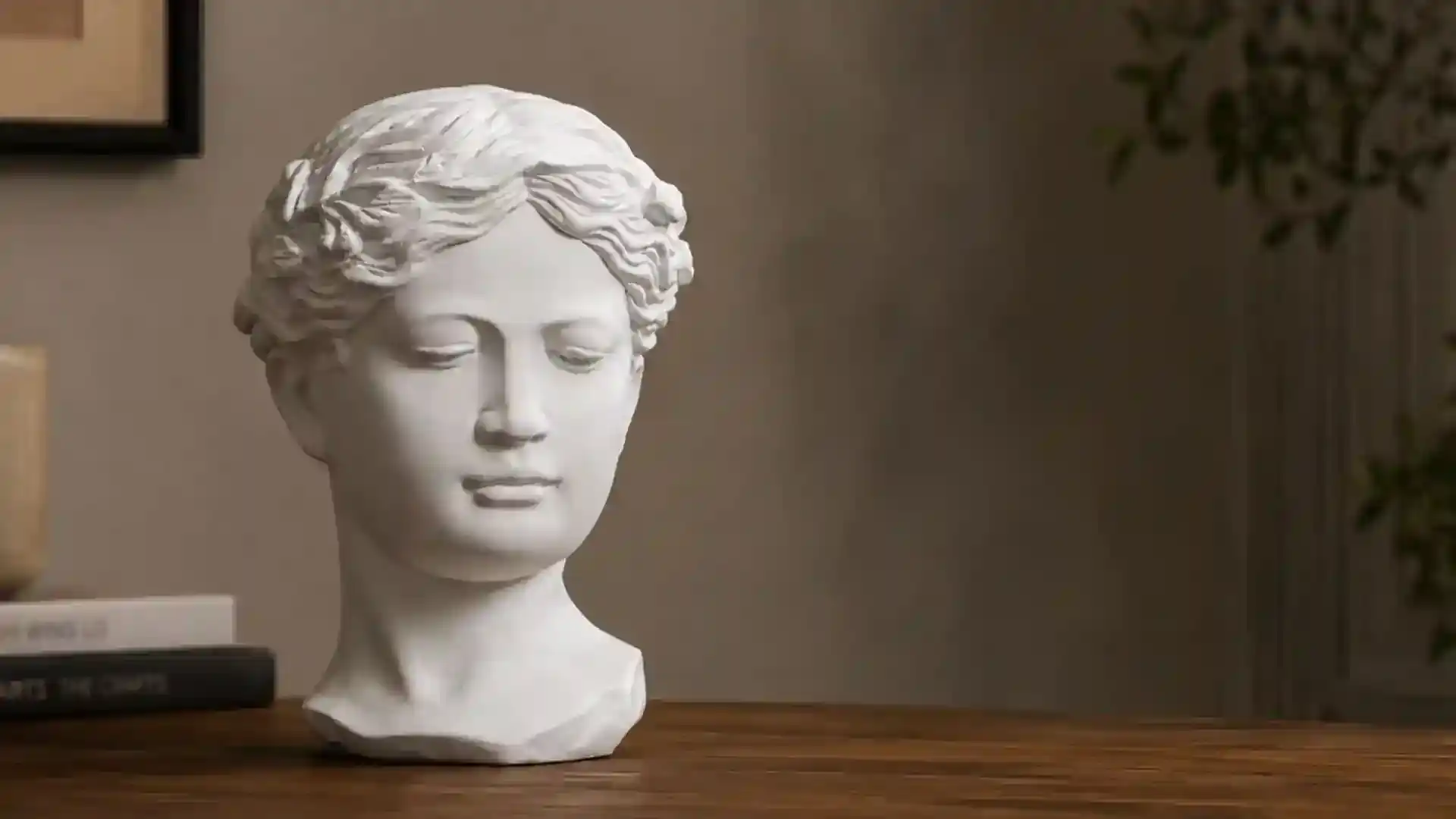
Decorative items can give a room personality, introduce visual interest, and turn otherwise empty surfaces into expressive parts of an interior. Yet an attractive object does not automatically look right wherever it is placed. A vase, sculpture, tray, candle holder, framed piece, or decorative bowl may look appealing on its own but strangely disconnected once introduced into a particular room.
This usually happens because decorating is about relationships. Every object interacts with the furniture around it, the colors in the room, available space, lighting, materials, and nearby accessories. When those relationships feel disconnected, the decorative item may appear out of place.
Understanding why this happens can make decorating far more intentional. Instead of simply collecting attractive objects, you can think about how each piece contributes to the room as a whole.
The Scale Does Not Match Its Surroundings
Scale is one of the biggest reasons decorative objects appear misplaced. An item can be visually interesting while still being too small or too large for its surroundings.
Consider a tiny ornament sitting alone in the center of a wide console. Rather than becoming a focal point, it may seem lost against the available surface. On the other hand, an oversized sculpture placed on a narrow side table can dominate the furniture and make the arrangement feel crowded.
The dimensions of nearby furniture provide useful visual reference points. Larger tables, shelves, and cabinets can generally accommodate objects with greater visual weight. Smaller surfaces usually work more naturally with restrained accessories.
Grouping smaller objects can also create the visual presence needed for a larger surface.
The Colors Feel Disconnected
A decorative item does not necessarily need to match the room's exact color palette. In fact, contrast can make an interior more interesting. Problems arise when a color appears without any visual connection to its surroundings.
Imagine a room filled with muted earthy shades and one intensely bright decorative object. That contrast could become an intentional focal point. However, without another detail connecting to that color, the object might simply appear accidental.
Color repetition can solve this problem. A shade appearing in artwork might reappear subtly in a vase, cushion, decorative bowl, or other accessory.
This does not mean repeating identical colors everywhere. Similar undertones and related shades can establish enough connection to make an arrangement feel deliberate.
There Is Too Much Competition Around It
Sometimes the decorative item itself is not the problem. Its surroundings are.
When every surface contains numerous accessories, individual pieces begin competing for attention. Sculptures overlap visually with frames, bowls sit beside candles, and several objects may have equally bold patterns or shapes.
The result can become visually noisy.
Negative space is therefore an important decorating tool. Empty areas allow the eye to distinguish one decorative element from another. They can also emphasize objects that deserve greater attention.
Instead of filling every available gap, consider which pieces contribute something meaningful to the composition. Removing an unnecessary accessory can occasionally improve an arrangement more effectively than adding another one.
The Style Has No Visual Connection
Mixing decorative styles can create distinctive interiors. However, successful mixing usually depends on finding some common visual language between different pieces.
A highly ornate object, for example, can appear disconnected in a room dominated by clean shapes and understated surfaces. That does not mean the object cannot work there. It simply needs something that connects it to the surrounding environment.
That connection might come through color, material, shape, texture, or repetition.
Rather than asking whether every object belongs to the same style category, look for shared characteristics. Two very different accessories might still complement one another because they feature similar finishes or geometric forms.
The Placement Feels Random
Where an object is positioned can influence how intentional it appears.
Decorative items placed without considering nearby furniture or architectural features may seem as though they were added simply because an empty space existed. Strong arrangements usually respond to something around them.
A centerpiece relates to the table beneath it. Objects on shelving relate to shelf dimensions. Accessories on a console can respond to artwork or a mirror above them.
Think about invisible visual lines when arranging decorative pieces. Objects can align with furniture edges, sit beneath larger wall elements, or create deliberate asymmetry.
Placement becomes stronger when there is a visible reason behind it.
Everything Has the Same Height
An arrangement containing objects of identical height can sometimes feel unusually flat. Variation creates movement and gives the eye a natural route through a display.
Try combining taller, medium, and shorter pieces. A tall vase might sit beside a medium sculpture and a low decorative bowl, creating a gradual visual rhythm.
However, variation should not become randomness. Too many drastically different heights can make an arrangement feel restless.
The objective is to create enough difference to establish dimension while maintaining a sense of connection between the pieces.
The Material Conflicts With the Room
Materials influence the visual character of decorative objects just as strongly as color.
Glass may create a lighter appearance, while stone can introduce visual weight. Wood contributes organic texture, polished metal reflects surrounding light, and ceramic pieces can add softer surface variation.
An accessory can appear misplaced when its material feels disconnected from everything surrounding it.
Repeating materials elsewhere can create continuity. A metallic decorative object might connect visually with hardware, furniture details, lighting fixtures, or another small accessory.
Material repetition can be subtle. Even two or three related details may be enough to make an object feel integrated.
Lighting Changes How the Item Appears
Decorative pieces are experienced through light, which means lighting can dramatically change their appearance.
A dark sculpture positioned in a poorly illuminated corner may disappear visually. Highly reflective objects can produce distracting glare under direct lighting. Textured accessories may lose much of their character when insufficient light reaches their surfaces.
Before deciding that an item does not belong, observe it at different times of day. Natural daylight and evening illumination can create very different effects.
Sometimes moving an accessory a short distance is enough to reveal its texture, silhouette, or finish more effectively.
The Object Does Not Suit the Function of the Space
Context matters.
Decorative objects should make visual sense alongside how a room is actually used. A large centerpiece might look striking on a dining table but become inconvenient if it constantly blocks conversation or needs to be moved during meals.
Similarly, excessive accessories on a frequently used desk can reduce available working space.
Decoration works particularly well when appearance and practicality coexist. Consider movement, visibility, accessibility, and everyday activities before deciding where an item belongs.
An object should contribute to the atmosphere without making the space unnecessarily difficult to use.
There Is No Clear Focal Point
When several decorative pieces demand equal attention, the eye may struggle to determine where to look first.
Creating visual hierarchy can prevent this.
Choose one element to carry greater visual importance and allow surrounding accessories to support it. The focal object could gain attention through size, unusual form, contrasting texture, or distinctive color.
Supporting objects can then remain quieter in appearance.
Not every decorative piece needs to make a dramatic statement. Some objects work better as supporting details that connect larger elements throughout the room.
Final Thoughts
A decorative item often looks out of place not because there is something wrong with the object, but because its relationship with the surrounding space has not been fully considered.
Scale, color, material, lighting, spacing, placement, height, functionality, and visual hierarchy all influence whether an accessory feels naturally integrated. Even an unusual piece can work within an unexpected setting when there is enough visual connection around it.
When something feels wrong, resist immediately replacing it. Try moving it, removing nearby clutter, changing its grouping, adjusting the lighting, or introducing a subtle connecting element elsewhere in the room.
Thoughtful decorating is less about filling surfaces and more about creating relationships between objects. When each decorative item has enough space, context, and visual purpose, the entire room can feel more cohesive, expressive, and intentionally arranged.